Key Questions:
- What is a graph?
- What are three kinds of graphs?
- How do you select the appropriate graph for data analysis ?
- What is a graph?
- What are three kinds of graphs?
- How do you select the appropriate graph for data analysis ?
What is a graph?
A graph is a visual way to organize data. Scientists sometimes use graphs to see how changing one variable affects another variable. Graphs are also useful for making comparisons between different sets of data. In this section, you will learn about the types of graphs and how to make a line graph. Types of graphs A graph is a picture A graph is a picture that shows how variables are related. Graphs are easier to read than tables of numbers, so they are often used to analyze data collected during an experiment. Types of graphs Some types of graphs are line, bar, and pie graphs.
A graph is a visual way to organize data. Scientists sometimes use graphs to see how changing one variable affects another variable. Graphs are also useful for making comparisons between different sets of data. In this section, you will learn about the types of graphs and how to make a line graph. Types of graphs A graph is a picture A graph is a picture that shows how variables are related. Graphs are easier to read than tables of numbers, so they are often used to analyze data collected during an experiment. Types of graphs Some types of graphs are line, bar, and pie graphs.
|
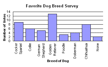
Title: Favorite Dog Breed Survey
X axis: Breed of Dog (Independent Variable) Y axis: Number of Votes (Dependent Variable) What is the favorite dog breed? What is the lease favorite dog breed? |

Types of Graphs
A line graph is used when one variable causes a second variable to increase or decrease in value. For example, the more gas you put in a car, the farther it travels (Graph A).
A bar graph compares categories of information (Graph B).
A pie graph is a circular graph that compares categories of information. The data are usually written in percentages (Graph C).

|
Making a line graph
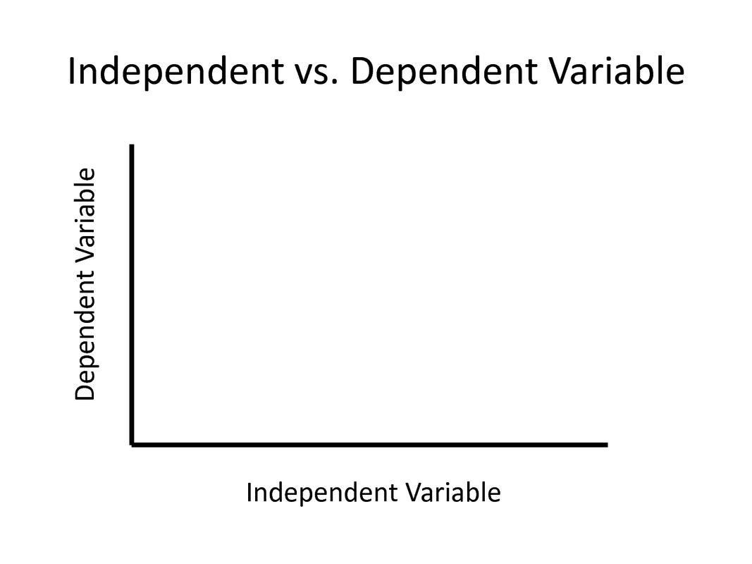
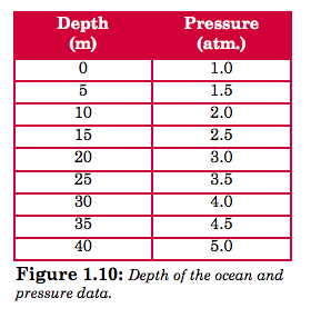
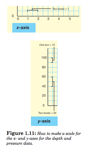
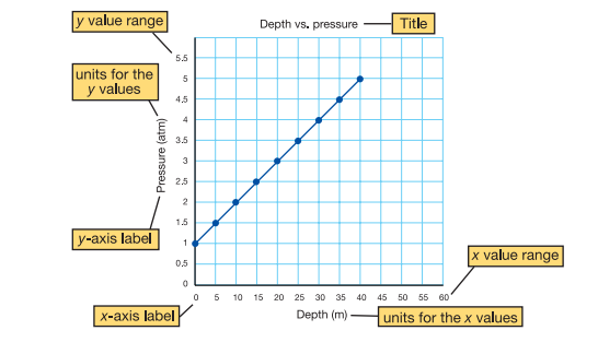
Independent and dependent variables A line graph shows how a change in one variable influences another variable. The independent variable is the variable you believe might influence another variable. It is often controlled by the experimenter. The dependent variable is the variable that may be influenced by the independent variable. How to graph variables The following example illustrates how to graph variables. An example As a scuba diver goes deeper under water, she has to think about pressure. How does an increase in depth affect the pressure? Pressure is measured in units of atmospheres. You live at Earth’s surface under a pressure of 1 atmosphere. Figure 1.10 shows depth and pressure data. A graph can help you visualize the relationship between the depth of water and pressure. Step 1: choose x and y-axis Depth is the independent variable because we are interested in how it affects pressure. The independent variable always goes on the x-axis of a graph. The dependent variable always goes on the y-axis. In this example, pressure is the dependent variable. Step 2: make a scale To create a scale for a depth versus pressure graph, you first make a scale. The word scale refers to size of something. When talking about a graph, scale refers to how each axis is divided up to fit the range of data values. Use the formula below to make a scale for any graph. Data range ÷ number of boxes on the axis = value per box Suppose your graph has 12 boxes on each axis. Figure 1.11 shows how you would create a scale for the x-axis. Figure 1.11 also shows how you would create a scale y-axis of the graph for depth and pressure. Step 3: plot your data Plot each point by finding the x-value and tracing the graph upward until you get to the right y-value. Make a dot for each point. Draw a smooth curve that shows the pattern of the points (shown below). |
|
|
Step 4: create a title Create a title for your graph. Also, be sure to label each axis and show units (shown above). Do you see a relationship between the variables?
|
|
Reading the Graph
Identifying relationships between variables on a graph.
Patterns indicate relationships When there is a relationship between the variables the graph shows a clear pattern. The speed and distance variables below show a direct relationship. In a direct relationship, when one variable increases, so does the other. When there is no relationship the graph looks like a collection of dots. No pattern appears. The number of musical groups a student listed in one minute and the last two digits of his or her phone number are an example of two variables that are not related.
1. Identify what the graph represents. Most graphs will have a clearly labeled x-element, spaced along the graph's horizontal axis, and a clearly labeled y-element, spaced along the graph's vertical axis.
- The graph's title should also tell you exactly what it's about.

|
2 Check the scale for each graph element. This applies to both line graphs and bar graphs.
|
|
3 Locate the graph element you want information on.
|

|

|
4 Read directly up from "August" until you find a dot or a slanting line, on a line graph, or the top of a bar for a bar graph. Then read straight across to the left until you hit the graph's labeled y-axis. Whatever quantity that line intersects with is the measurement for salmon return in August.
|
Let's Practice Graphing!
|
|
|
|
|
|
